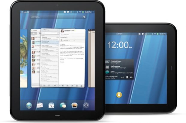
Er schijnt een hoop nieuwigheid aan te komen in webOS 3.0, waaronder het verdwijnen van Google Maps en toevoegen van Bing Maps. Onderstaand vind je een complete lijst met alle updates die volgens PreCentral zijn doorgevoerd.
• Launcher: An arrow/home button on the bottom right brings up a new tabbed launcher with tabs labeled “All” and “Favorites”
• Rearranging apps: press and hold now launches an “edit mode” where apps can be moved, deleted, or removed from a customized launcher page. Press “done” to complete the process.
• Just Type: webOS’s universal search feature is now tabbed, like the launcher, and muted gray in appearance. Recent searches and the virtual keyboard appear when you tap the search bar.
• Virtual Keyboard: Text Predication has been added, not just to help you complete words (as with Text Assist introduced in webOS 2.0), but to predict what word you’ll type next.
• Notifications: Notifications are now at the top of the screen, next to the device menu. If you receive more than one notification from the same app, you can swipe through them and drill down into the message you’re interested in. This doesn’t delete or mark as “read” the other notifications you swiped through while doing so.
• Browser: Now called “Browser” not “Web,” the new browser has removed the grid of bookmark icons and replaced it with a Bookmarks/History button that slides out a panel with Bookmarks, History and Downloads buttons at the top. A bar at the bottom shows the progress of a loading webpage and disappears when the loading is complete. The navigation bar does not disappear as you scroll down on a webpage.
• Calendar: Now redesigned, the app shows your current calendar in the middle of the screen, with the bottom offering buttons for creating events, switching views, etc. Buttons at the top let you switch to other calendars. The design is new, but everything else here works the same as before.
• Contacts: No changes here besides slight tweaks to the lettering style.
• Email: Similar to email on the iPad, the folder list disappears in Portrait view, but is present in Landscape view. Buttons at the bottom lets you compose, refresh and now, mass edit (meaning select multiple messages at once to add flags, delete, move, etc.)
• Exhibition: The “screen saver” like mode is now bigger, and more stretched out. Time, Agenda and Photo options are available, but only Time was functioning. Both an analog and flip clock are offered.
• Maps: The biggest update to webOS 3.0 is a switch from Google Maps to Bing. The new interface offers a search bar at the top, which also provides access to recent searches and favorites, a Directions mode, Suggested Searches (when it doesn’t understand your query), and more. You can drag and drop pins, turn on or off GPS, and switch between road, aerial and Bird’s Eye (3D) views.
• Memos: Cork pad and push pins are gone and memos are larger. You now press “edit” to move notes around, instead of press and hold.
• Messaging: Now two-paned, but functionality remains essentially the same.
• Music: The app has been overhauled, offering a two-paned view, with songs on the right and sort/filtering options on the left, plus a cover flow-like view of music, and a notification area mini-player with access to controls.
• Photos & Videos: The two apps are now one, and integrate device pictures with those from Facebook. Album, filmstrip and fullscreen views are available. Facebook comments are shown, too.
Hieronder vind je ook nog een video die een snelle indruk geeft van waarmee je zult werken in webOS 3.0.
We kunnen niet wachten op de TouchPad want dit systeem ziet er veelbelovend uit.






Reacties (0)